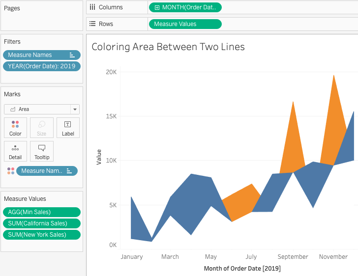
This topic came as a question from a colleague. I found the same question on Tableau community site which was unanswered. There is a similar post on the topic, a method first proposed by Zen Master Mike Cisneros. But it is about a single measure while the question is about two measures. So I am writing here a short answer to it. Note that this approach works for both single-measure and two-measure cases. That is, split the single one into two measures if necessary.
Using the superstore data set, I created California Sales and New York Sales to emulate 2 different measures. Such as:
The key is to create the lower sales of the two:
Then we can create an area chart with 3 measures while stack mode is turned off.
We thus get the expected result. The chart has actually three area charts overlapping each other. Note that Min Sales is paint White. And it's on top of the other two measures. The order of the three measures in Measure Values is very important. No dual axis is needed. Instead, this implementation allows us to add another chart via dual axis in case of need.
Note that the area difference doesn't match exactly the line difference. This is due to the fact that, between two data points, Tableau is using interpolations which behave differently in area chart and in lines.
The demo workbook can be found here. The link may not work because Tableau Public is going through an upgrade. If not, just go to my profile and you can find it.
Feel free to leave comments if questions.


No comments:
Post a Comment