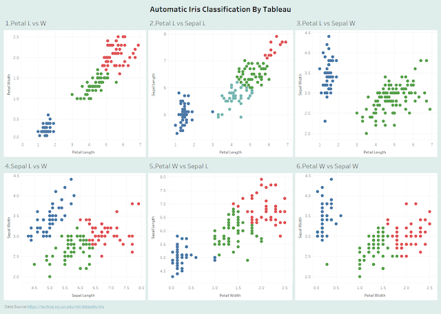
This is a blog about an event at 2019. My Tableau Public dashboard was originally published on 7/16/2019.
A colleague gave a talk on this classic example of machine learning or data science: Classify Iris according to a simple set of observation data. He did his demo in Python. I kind of understood what the example was about. But I figured we can recreate the same classification using Tableau's native clustering function. I presented the result to the team and the visual approach was welcomed because it helped understanding a great deal.
The Iris data set is a famous one. It's being used in all sorts of classification approaches to validate the algorithms. It's easy to find the data online https://archive.ics.uci.edu/ml/datasets/iris
The Data Set
There are 150 flower records in total and 3 flower classes (setosa, versicolor, verginica). Each class has 50 records. Each flower has 4 measures in Petal Length, Petal Width, Sepal Length and Sepal Width.
The Approach
The idea is to use the 4 measures like Petal Length, Petal Width, Sepal Length and Sepal Width to cluster the data. The resulting clusters will need to compare with the actual flower classes. A good algorithm will
- Have the correct number of clusters (3 in this case)
- Have few mismatches (a mismatch is where a flower of one class is clustered into another class
We will use Tableau's native cluster method to classify the records.
Define The Number of Clusters and What Measures to Use
We have 4 measures available. It's possible to use any one of them, or any 2, any 3 or all 4 of them to feed the cluster algorithm and get the clustering result. We can pre define the number of clusters or let the algorithm to decide. In this post, we will set the number of clusters to be 3, the same as the number of known classes. You can vary the number of clusters if you wish.
We will use 2 of the measures at a time. Given 4 measures, we have 6 possibilities. We try to compare which pair of measures will produce the best result or the best matches.
The Process
Pick the pair of Petal Width and Petal Length.
1) Create a scatter plot using Petal Width, Petal Length and ID.
2) Go to the analytics tab and drag Cluster to the canvas.
After selecting the only cluster method, we will obtain the following chart with 3 clusters by default. An interface pops up for entering the number of clusters we wish, or leaving it to be automatic which is 3.
We can also drag more measures to the box of variables or remove them from it. This will change the resulting clusters if we do so. The minimum is one variable.
The 4 measures can have 6 pairs of variables. We create all of them and put them
in a dashboard.
Details about the Cluster
For the curious bunch, we can get more details about the clusters. Right click on the "Cluster" pill and select "Describe Cluster". We will open Summary and Model about the clusters.
The Quality of Clustering: Comparison between 6 Pairings
By bare eye inspection, we see that the pairs (2.Petal Length, Sepal Length) got 4 clusters by automatic clustering and (3.Petal Length, Sepal Width) got 2 clusters. The algorithm failed to find the correct number of clusters which is 3.
The following parings all resulted in 3 clusters. The first pairing is the best with the fewest mismatches.
(1.Petal Width, Petal Length): 6 mismatches
(5.Petal Width, Sepal Length): 18 mismatches
(6.Petal Width, Sepal Width): 11 mismatches
(4. Sepal Width, Sepal Length): 30 mismatches
Conclusion
We showed how to create clustering in Tableau via the well known Iris data set. We only studied the cases where a pair of measures are used. 2 of the 6 cases didn't produce the expected number of clusters by automatic clustering. 4 of the rest cases produced 3 clusters which is expected. Among the 4, the best got 6 mismatches. The worst got 30. We will write another post on how to assess the quality of clustering.
Tableau's clustering method is not perfect. But it gives us a drag and drop tool for us to get a quick glance of the classifying result. It's based on
K-means clustering.


No comments:
Post a Comment