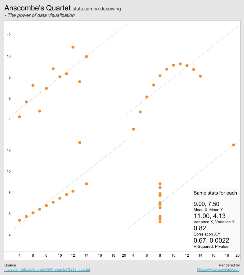
Francis Anscombe, a British statistician and a professor at Princeton and Yale, constructed 4 different sets of data which all have the same stats, known as Anscombe's quartet. However the quartet's data distributions are quite different.
Stats alone can be deceiving. Through data visualization, we can gain powerful insights into their differences.
So, I decided to render Anscombe's quartet in Tableau. All calculations are based on Tableau's native functions. Without this exercise, I may never get chances to use some of the statistical functions in Tableau. Hope that this can inspire more people to use them, such as:
Correlation: WINDOW_CORR(SUM(X), SUM(Y))
Here is the resulting dashboard, rendered in a single sheet. Feel free to download it.
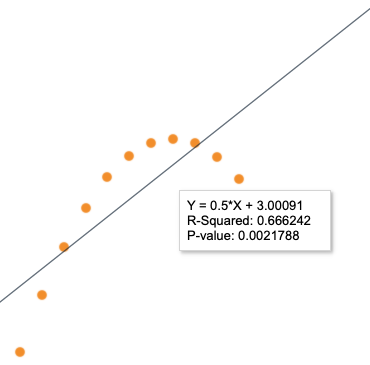
All the trend lines are also identical after being rounded to two decimals. The trend lines are generated by Tableau based on data. We can see that the R-Squared and P-value are also the same.


No comments:
Post a Comment