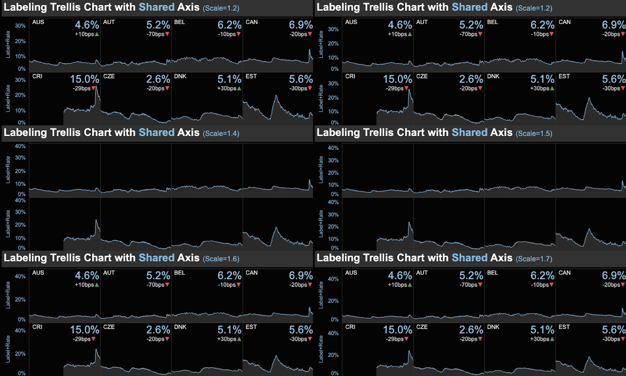
This post is about labeling a trellis chart that's already in dual axis.
In earlier posts on labeling trellis chart, we use one axis for the labeling function. Many times, the chart is already in dual axis (both axis are taken). What should we do then?
Here we are going to show two approaches about labeling a dual-axis trellis chart:
- Labeling with Stacked Axis
- Labeling with Shared Axis
Labeling with Stacked Axis
This is a simple approach. Please refer to this post on composing a label and on the formula for Label Height. Let's place the Label Height pill on the Rows to the left of the dual-axis measure pills. Then each trellis cell is split in halves. The labels will be placed in the top half. The chart is in the lower half. We can see that two axis are stacked up.
In the formatting panel, we can remove the line between two halves by lowering the Row Divider Level.The only drawback of this approach is that the dynamic range of the chart is reduced by half. To some, this may be good enough.
Labeling with Shared Axis
In this one, we will use the Measure Names/Measure Values approach where two or more measures can share the same axis. First we create a shared axis between Label Height First/Last and the key measure (Unemployment Rate), before dual-axis-ing with another measure. This approach, the dynamic range of the chart is not affected, given the same canvas space.
The Label Height Scaled field is created as follows:
The first window function is to compute the max value of Unemployment Rate across the entire Date and Country Name. Then it is scaled by a parameter that is >=1. This formula will guarantee that the data marks for labels will be no lower than any data mark in a chart. This fact will be used in label settings where we only show those labels at the max Measure Values.
The field Label Height First/Last is as follows, which keeps only the necessary data points.
We can use the Scale parameter to fine tune the dynamic range of the chart.Note that in the Label setting, we need to select Measure Values and set the labels to be at the max. Allow labels to overlap other marks.
We showed that even for a dual-axis-ed trellis chart, we can still label them.
Feel free to leave comments or contact me at twitter@aleksoft.


No comments:
Post a Comment