Subtitle: Sunburst Chart with Labels Inside and Categorical Sequential Colors
Here I am presenting how to design Sunburst Chart with practical considerations, such as:
- Labels inside
- Categorical sequential colors with dynamic data.
The design will be based on map layers, a new feature since Tableau desktop version 2020.4. This post by Sebastian Depalla is a great source of inspiration.
First, here are two very important techniques when dealing with map layers.
Turn off Map Background
- This is actually the last step. After you have done all the following steps, turn off the map background: set Menu Map>Background Maps to None. Once it's off, you can't add layers.
Size the View
- Use Ctrl-Shift-B/Ctrl-B to increase/decrease the size of the entire view (all layers included)
- Use the Size card to the max
Create Center
- Use the formula MAKEPOINT(0,0) to create a field called Center.
Create Subcategory Pie Layer
Drag the field Center to the view. Change the data mark to Pie. Drag the fields to the Mark's cards exactly as in the following screenshot.
- Size the view with Ctrl-Shift-B as big as you can.
- Place Category above Subcategory.
- Sort either of them by the field Sales descendingly.
- Place Sum(Sales) in Color. Edit Color using deep gray to create sequential color.
- Click Color card and set the color opacity to be ~55%
Create Category Pie Layer
Drag the field Center to the view and create a new layer. Change the data mark to Pie. Drag the fields to the Mark's cards exactly as in the following screenshot.
- Size the pie with the Size card and make it smaller than the Subcategory pie. Leave enough spaces for labels.
- Place Category above Subcategory.
- Sort either of them by the field Sales descendingly.
- Place Category in Color and Subcategory in Label.
- Set the Label font color to white (showing labels in black for illustrative purpose only )
Create White Circle Layer
Drag the field Center to the view and create a new layer. Change the data mark to Pie. Drag the fields to the Mark's cards exactly as in the following screenshot.
- Size the pie with the Size card and make it smaller than the Category pie. Leave enough spaces for labels.
- Place Category in Label.
- Sort Category by the field Sales descendingly.
- Set Color to white. (showing black border for illustrative purpose only)
- Set the Label font color to be white (showing labels in black for illustrative purpose only )
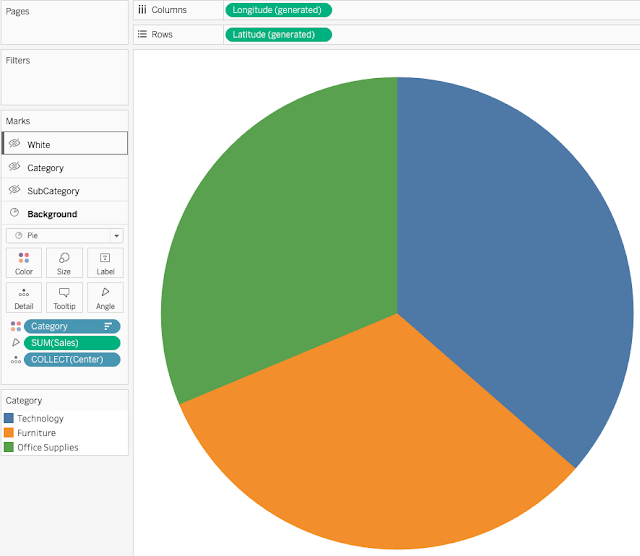
Create Background Layer
Put this layer under the Subcategory layer will generate categorical sequential colors.
Drag the field Center to the view. Change the data mark to Pie. Drag the fields to the Mark's cards exactly as in the following screenshot.
- Size the pie with the Size card to the Max.
- Sort Category by the field Sales descendingly.
- Place Category in Color.

Put Layers in Order
The order of layers is as follows:
Drag the layers to arrange them in the above order.
Voila. It's done. You can download the demo workbook here.
If questions, leave comment or contact me via twitter @aleksoft
PS: Fine-Tuning the Labels (6-Layer Sunburst Chart)
In the above workbook, we included a 6-layer Sunburst chart as well. The idea is to allow us to fine tune the position of the labels.
By default Tableau places the labels very close to the exterior of the circle. We can manually move the labels individually to a different place. It's not good for dynamic data visualization.
To make the position of the labels tunable and predictable, we added a transparent pie layer. For example, we can insert a Transparent Pie layer between the White layer and the Category layer, and place the Category labels on the transparent pie. By tuning the size of the latter via the Size card, we can determine the location (radius) of the labels.
To make a pie transparent, we only need to set a regular pie's color opacity to be 0%. Note that the transparent pie has exactly the same dimensions and measure as the one that it puts labels on. It is smaller in size (radius) and is transparent.
In the 6-layer dashboard, we inserted two transparent pies for two sets of labels: Category and Subcategory.
You can see that the labels are placed a bit more away from the circles than the default placement by Tableau.


No comments:
Post a Comment