- showing the top N teams in regular slices.
- showing the rest of the teams in a single slice: "Others".
- N is a parameter that one can pick between 1-19.
- pie slices are sorted clockwise and "Others" is the last slice.
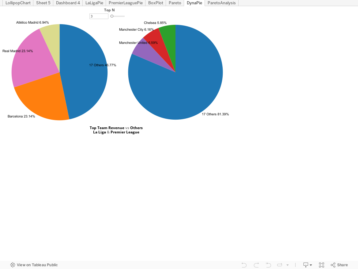
1.Create a [Top N] parameter. N is between 1-19, because the number of teams in a league is 20 and 20 vs 0 doesn't make sense. Right-click on the parameter and show parameter control.

2.Create two calculated fields: [PremierLeague Revenue] and [PremierLeague Team]. The original data table has 3 columns: League, Team and Revenue. These two fields extract the Premier League part of the data. It is similar to create [PremierLeague Team].


In Top tab, pick 'By field' and make sure to select the [Top N] parameter.

4.Create Top N Team labels and "Others" labels. This is done through a calculated field. The logic lets the label be the team name if in top N teams, else it shows "Others". 20-N is the number of teams in 'Others'.

5.1 Select chart type to be Pie Chart
5.2 Drag [PremierLeague Team Labels] dimension to the color shelf and sort it by revenue in descending order. This way the pie will be clockwise by order of revenue.
5.3 Drag [PremierLeague Revenue] measure to the angle shelf. This will create slices with different sizes in proportion to the team revenue.


6.1 Create a blank dimension and drag it to both row and column shelves. Then click on the pills to hide both row and column headers. There will be more canvas for the pie chart.
6.2 Exclude the null values
When N>=19, in the color legend, there appears a 'Null'. It is part of Others most of time except when N>=19 where Others doesn't exist. For cleanup, click on the 'Null' in color legend and exclude it.

Voila, we will have a dynamic pie chart for Premier League. Then do the same for La Liga and use the same [Top N] parameter to control it. We can thus compare the top team share of the TV+commercial revenue and the rest of the league!
Top N & Grouping Others Series
No comments:
Post a Comment