It would be good to have a few different representations so that we can view the dataset in complementary ways. This is likely to offer the viewers more insights. We are not talking about slicing or dicing here.
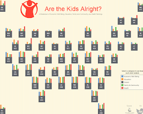
In this Viz of the Day on 7/7/2016, the author Nick Hura created a viz on the rankings of 50 US States in 5 different metrics. The visual looks great and attractive! It tells us the rankings of each state quite effectively. Those little bars on a big square is a great design. The map layout is a popular index view of the states.

The new view is presented using the visual tooltip technique. The key steps in this design are:
- Create the bump chart
- Create a dimension "One" with value 1. This field shows 1 in all the rows.
- Create an action filter based on "One". This will turn on/off the entire bump chart.
- Create a highlight action filter based on State. This will highlight the selected state.
With the added view, we have a better idea where each state compares with others.
No comments:
Post a Comment