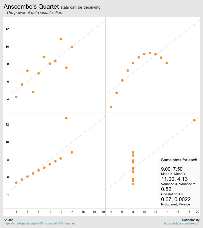
1. Christine suggested me to have a look at Simpson's Paradox, following my recent posts on Anscrombe's Quartet and Datasaurus Dozen. They are all about learning to look at statistics in an impartial way.

    Simpson's Paradox is about the difference between the stats of an entire data set and the stats of the same data set sliced by a dimension. They can be quite different or even contradictory. We can't take one for the other.

    We are going to show some visualization techniques to compare the whole vs the parts through two examples.

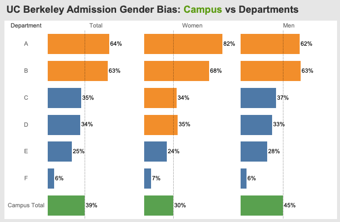
    UC Berkeley Admission Gender Bias

    The data is from here. From the campus total percentage, we see that the admission rate is 39%. Then men's rate is 45% and women's is 30%. So it seems that there is a campus wide bias against women. However at the department level, we see that departments A and B have very high admission rates for women. They are even higher than those for men.

    So it's not enough to just draw conclusions from the stats of the entire school. It may not be fair to some of the departments. We need to look further into the departments. 

    Superstore Sales Trend

    The similar story goes for sales trend. We can calculate the growth rate trend of sales for the whole business. But we also need to look into the sales trend of every product category, or that of each state. The overall trend may not represent that of a single category or of a single state.

    We can see that copiers and phones sales are growing faster than the overall business. Some are growing in a rate similar to the overall rate. Some are flat and lag behind. 

    Because we are comparing only the gradients of sales trend, the dual axis are not synchronized.

    Feel free to download the workbook and explore it. Leave comments if you have something to share.


    0

    Add a comment

  2. #TweakThursday: From time to time I tweak someone else's public viz and try to make it better to my subjective view.

    How does one use horizontal bars and vertical bars? How to order time-based multiples in a trellis chart?

    Here are my own rules of thumb:
    • Vertical bars are for time-based trends.
    • Horizontal bars are for categorical comparison.
    • Always place the latest cell in a time-based trellis at the top-left corner where the focus is.
    I found that Professor Klaus Schulte's recent MakeoverMonday viz submission is quite interesting. I just tweaked it a bit according to the above rules. Hope it makes the viz a bit more interesting.

    Here is my resulting viz. Feel free to download it and explore.

    Note that the vertical axis is the bins for the histogram. We easily see France is placed in higher bins than the other 3 highlighted countries recently. Since the most recent is more interesting than the past, placing the the latest cells at the top left corner makes it easier to check.
    Had a few exchanges with Klaus in Twitter about my reasoning behind the edit.


    0

    Add a comment

  3. This post is about 13 data sets, known as Datasaurus Dozen, that have the same stats and different distributions. Stats can be deceiving while data visualization can makes a big difference.

    Inspired by Anscombe's quartet and Alberto Cairo's Datasaurus, Justin Matejka and George Fitzmaurice crafted another 12 datasets which have the same stats and different distributions. Thus the Datasaurus and the Dozen.

    Here I recreated them in a Tableau dashboard and calculated dynamically all the summary stats using the native table calculation functions in Tableau. We verified that the 13 datasets have the same stats. But they do visualize differently. Feel free to download it and explore it on desktop.

    I noted that R-Squared is a bit different from each other, while Anscombe's quartet's R-squared's are much closer to each other.
    By the way, it's the first time for me to use the native animation function in Tableau to create this gif. Unfortunately Tableau Public can't run this because it says the chart is too complex. If you wish, download it to your desktop where one can view much better visual effect.


    Happy exploring with Tableau!
    0

    Add a comment

  4. Francis Anscombe, a British statistician and a professor at Princeton and Yale, constructed 4 different sets of data which all have the same stats, known as Anscombe's quartet. However the quartet's data distributions are quite different. 

    Stats alone can be deceiving. Through data visualization, we can gain powerful insights into their differences. 

    So, I decided to render Anscombe's quartet in Tableau. All calculations are based on Tableau's native functions. Without this exercise, I may never get chances to use some of the statistical functions in Tableau. Hope that this can inspire more people to use them, such as:

    Variance: WINDOW_VAR(SUM(X))
    Correlation: WINDOW_CORR(SUM(X), SUM(Y))

    The stats summary is generated dynamically and displayed via annotation.

    Here is the resulting dashboard, rendered in a single sheet. Feel free to download it.

    All the trend lines are also identical after being rounded to two decimals. The trend lines are generated by Tableau based on data. We can see that the R-Squared and P-value are also the same.

    Here is the quartet's data:
    Anscombe wanted to let people know that stats are not enough to characterize a data set. Visualization is important to help us understand data and get more insights into the data. He wrote a 5-page paper in 1973 to stress on using graphs for statistical analysis.
    Hope that this helps us better understand the value of data visualization.


    0

    Add a comment

  5. In a single day, I am asked twice the same question: how to install database drivers for Tableau in Mac? The question of the day is regarding the drivers for Presto and PostgreSQL databases. The docs online may not answer the question exactly. 

    Here are the exact steps:
    1. Search the driver in question and download it to your computer. It's usually in the form of a .jar file.
    2. Open your Mac Finder and copy the .jar file.
    3. Hold the Option key and click the Finder menu Go. Select Library.
    4. Go to Library>Tableau>Drivers
    5. Paste the .jar file there.
    Without holding the Option key, the menu Library will not show up.

    Now open your Tableau desktop. You should be able to access the database in question.

    Have fun with Tableau!

    0

    Add a comment

  6. There are always more than one ways to skin a cat. In Tableau, there is always one more way to design the same chart. Mastering them will give us more options to satisfy the various requirements we may be asked for.

    Line chart is one of the most basic ones. Yet we can draw them in more ways than we care of. But there are many intricacies that are interesting to master.

    In graphical design, every tiny bit of space counts because the canvas may be limited or because of alignment with other parts of the dashboard. In this post, we are going to show how to design line charts with minimum axis offset.

    Axis Offset with Date in Columns Shelf

    This is the default way of creating a line chart. One can notice that there exists always a horizontal offset at the first data mark from the vertical axis. With continuous date, the offset is big. With discrete date, there is half a tick offset. We have no way to edit the offset. 

    Note that we dual axis'ed the line chart with an area chart to emphasize both the trend and the volume.

    Note that with discrete date, we need to turn on "Show missing values" to create the correct line chart.

    Axis Offset with INDEX() in Columns Shelf

    To have more control over the axis offset, we can place continuous  INDEX() in the Columns shelf and the date dimension in the Detail shelf. Set INDEX() to compute along the date dimension.

    An important caveat is we need to first set up the date dimension on Rows/Columns and turn on "Show missing values". Then drag it to the Detail shelf. This guarantees correct indexing even though we don't have contiguous data.

    Edit the axis to be fixed start at 1, and end with automatic.

    Now we have the line start at the vertical axis. The offset is 0 which is the least.
    We can still have INDEX() in discrete. The offset is the same as the chart with discrete date in Columns.

    Line Chart Multiples with INDEX()

    We may need to create line chart multiples when splitting a line chart per category (State in the following example). We still like to create them with continuous INDEX() in the Columns shelf so that we have zero axis offset. Then we need to set up the date dimension with "Show missing values" in the Columns shelf before moving it to the Detail shelf.

    A very important addition here is to place an INDEX() in the Detail shelf. Then set up its table calculations along the date dimension first and State second (Respect the order pls). 

    The 2-dimensional INDEX() is part of the data densification technique. We may not have all the data points at all dates and all states. This INDEX() in the Detail shelf will create a 2-d grid by Date and State. This will guarantee that each line chart per state will be indexed correctly by INDEX() in the Columns shelf. 

    After the splitting by state, it is more likely that each line will miss some data at some dates.

    Without the two dimensional INDEX(), the line chart multiples will look like this. All lines will start at INDEX()=1. This is not correct.

    Summary

    In case a viz design requires that the line chart start with zero axis offset, we showed above that we can do it with Continuous Index in the Columns shelf. And in case we need to create line chart multiples with zero axis offset, we can add a two-dimensional INDEX() to achieve it.

    The demo workbook can be downloaded from here.


    0

    Add a comment

  7. I almost named the post as Charting "Top N and Others" via Post-filtering. Read on to understand why.

    Visualizing "Top N and Others" is an often required business use case. A popular solution is by creating a top N set. That's the one I have been using through the years.

    I wrote a post in the context of a pie chart back in 2014 on grouping those smaller slices into 'Others'. 

    Recently, I encountered an issue at work. The dashboard won't let me using set. The problem with this set-based solution is that "set" is a filter operating before the regular dimension filters. We may want the dimension filters to execute before the set. This can be done by adding the dimension filters to context. In a multi-sheet dashboard, this may impact calculations on other sheets when a cross-sheet filter is applied, where the dimension filters may not be allowed to be in context.

    There are almost always two ways to skin a cat in Tableau: Pre-filtering and post-filtering.

    Pre-filtering: Filter the data set and keep only the data we need. This works with dimension filters, set filters, context filters etc.

    Post-filtering: Filter the calculation results and keep the results we need. This works with table calculation filters.

    Here we are going to show a table calculations approach to solve the problem. Table calculations filtering takes place in the last stage in Tableau's order of operations. So it works after the regular dimension filters. This is a post-filtering approach.

    We are going to show our approach using the superstore data set and chart sales in top N states plus all others in one bar.

    First let's create an integer Top N parameter. And have the State dimension is sorted by SUM(Sales).

    Then create a formula for Label Grouped which includes the top N states plus "All Others".

    Third, create a formula for Sales Grouped where all sales beyond top N states are grouped in a single quantity.

    Last, create a top N+1 index filter for keeping the top N+1 bars.

    The resulting chart looks like this:
    Make sure that all the table calculations are computed along State.

    Voila, the demo workbook can be downloaded from here.
    0

    Add a comment

  8. Angel works in Finance. She often asks me questions on calculations in a table. Today I got this question: How to calculate Year over Year (YoY) change ratios for both quarterly and yearly sums, in a single sheet?

    Here is the solution we got. First there are two parts for the YoY calculation.

    For the quarterly YoY, we can apply this formula:
    SUM([Sales])/LOOKUP(SUM([Sales]), -4) -1

    For the yearly YoY, the above formula doesn't work. We need a slightly different one like:
    SUM([Sales])/LOOKUP(SUM([Sales]), -1) -1

    To combine them in a single one, we got this:
    Note that CountD()=1 is equivalent of Max()=Min() when we deal with grand total/subtotal calculations.

    Then the results are shown in this table:
    The above formula works well logically. Here we have a few variants that look simpler.
    They all work for YoY calculations. Pick the one you like if you need one.

    Download the demo workbook here.
    0

    Add a comment

  9. Just came back from Tableau Conference 2022 at Las Vegas. What an exciting event! The most exciting thing is reuniting with old friends and meeting with the datafam people known online for years.

    Attended first time the Tableau Visionary summit. It's a great opportunity for meeting other visionaries, Tableau/Salesforce PMs and executives.

    During the summit, one executive (sorry I am terrible with names) challenged us with a question: how to increase the number of tableau users by 1 million?

    This rang a bell within me. I guess I have the solution to that! Frankly speaking, I have been imagining a social media platform built around data vizzies for years. To me, data viz is a media type by itself, just like video, image, sound, and text. Even PowerPoint has its own social platform: SlideShare.net. So, data viz deserves a social platform of its own. Let's call it Tableau Social.

    What is Tableau Social?

    It's a social media platform where people share vizzing activities (publish, update), discover vizzies and interact with authors/viewers (like, share, comment).

    Why Tableau Social?

    Currently Tableau communities are mostly active in Twitter, LinkedIn, Youtube, Blog sphere, Tableau Forum and Tableau Public. Each of them has somewhat different functionalities and utilities. Tableau Social would be the one place that aggregates the links to content scattering around in various platforms.

    How does Tableau Social work?

    It works like your familiar timeline with a focus on vizzies. It's the Instagram for vizzies. Or shall we call it InstaViz.

    One can follow his/her favorite vizzers!

    One can like, comment any viz of interest.

    One can share/forward any viz of interest within Tableau Social or to other social platforms.

    Where to start?

    The version zero can be built upon Tableau Public: 

    - Add like and and comment functions to every viz.

    - Add a timeline user interface in addition to the current tiled one.

    Build a Magnet

    I believe, with Tableau Social/InstaViz, we can achieve multi million tableau users faster than any other type of marketing campaign. And it's a sustainable platform for a long time to come. More importantly, it's a magnet that will attract those who are interested in the data visualization revolution.


    0

    Add a comment

  10. A little enhancement in the formula editor can make a big difference for whose who create formula all the time in Tableau. Here are my wishes for a future editor. 

    Highlighting Syntax Words

    Currently a formula in Tableau can look plain and a bit uninspiring.


    I would suggest highlighting the syntax words like Case, When, Then, End etc. The result should look like this


    Talking about Tableau being a visualization leader ... This will distinguish user-input texts from Tableau-defined syntactic words. It will make the formula easier to read and debug.


    I would also add that we could highlight the quotes so that it becomes

        When 'California' Then 'CA'

    When there are multiple opening brackets, we may not know how many closing brackets are needed. So if we could color code the brackets, it may give users hints on how many closing brackets are missing and which is matching which. 

        WINDOW_MAX(IF ATTR(Category)="Technology" THEN SUM(Sales) END)

    Typing Suggestions

    I also think of a new suggestive option: When a user types CASE, Tableau suggests an option like
    CASE
    WHEN THEN
    WHEN THEN
    END
    This goes beyond completing a word: completing a statement or a function. Same goes for other structured statements like
    IF 
    THEN 
    ELSE 
    END
    And instead of DATEDIFF(), Tableau could suggest a bit more. The list can go on and on:
    DATEDIFF('', , ) 
    IIF( , , )
    IFNULL( , ) 
    LOOKUP( , )
    Voila. Part of this is from an old post in 2016 on Highlighting Syntax Words in Formula Editor. Hope it will become real someday. The purpose is for the tool to help productivity, faster typing, less typos and easier read and debug.

    Your inputs are also welcome. Feel free to leave comments below or contact me at twitter: @aleksoft or LinkedIn
    0

    Add a comment

Blog Archive
Loading
Dynamic Views theme. Powered by Blogger. Report Abuse.