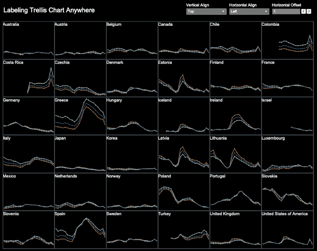
1. Sharon left a message in my last post on Labeling Trellis Chart Anywhere asking whether we can have one label on the left and another on the right per trellis chart cell in Tableau. Yes we can. Below we will show how to place multiple labels within a trellis cell.

    Label's Horizontal Positions 

    Assume our data is a time series and the horizontal dimension is Date. Then here are a few examples.

    • Label on the left is defined by First()=0.
    • Label on the right is defined by Last()=0.
    • Label in the center is defined by Index()=Int(Size()/2)

    Here are some of the labels we use in the above trellis chart:

    In the label editor, we compose the labels. Both the left label and right labels are placed on the first row. Depending on horizontal positions, some labels are on when the others are off. The 2nd row has only labels on the right. The alignment is set to be center-aligned.

    How many labels can we place within a trellis cell? Probably more than we need. We can add as many labels as there are dates or months. 

    Label's Vertical Positions

    In the previous trellis chart, both labels have equal height at the top. The height of both is defined by the following function:
    Note that the vertical axis is fixed from 0 to 1. Since we know there are only two labels and their exact positions, we could alternatively write Label Height 1 as
    • If First()=0 or Last()=0 Then 1 End
    The horizontal grid is defined already by Date. We will show how to use Label Height 2 to define the vertical positions of labels. 

    In the above chart, we have 2 labels per trellis cell. We write Label Height 2 as follows:

    Note that the height for the labels in the center is -0.2. The vertical axis is fixed between -0.2 to 1.

    Conclusion

    We can place multiple labels per trellis cell. And again we can label them anywhere. 

    Feel free to download the demo workbook. If you have questions, leave comments or contact me at twitter @aleksoft.
    0

    Add a comment

  2. Catherine came to my office asking if we can create a compact version from a sparse table in Tableau, so that the table would look a lot more compact. This allows a succinct view of the table content. It saves screen real estate and makes it easy to read for business audience.

    I mocked up her problem and this is something she would like to see:

    Of course we can. I remember I did something a few years back. We can use that technique to solve this problem.

    The Sparse Table

    The sparse table may result from any particular filtering. Here is my example.

    To create the sparse table, we first calculated the quarter over quarter (QoQ) sales ratio in the Superstore data set. Then the result is filtered to keep only those that have QoQ above 100%. 
    Then place the products (Sub-Category) on the Label card instead the of ratio. And we got the sparse table as shown in the first image above.

    Create a Ranking List per Column

    Note that the green pill filter (QoQ) is used to filter the table and keep only the items with QoQ >=100%. Then we need to create a unique rank list. Let's name it RankU.
    •     Rank_Unique(QoQ)
    Place RankU on the Rows and Sub-Category on the Details card. We get this:
    RankU's table calculations have to be set up properly. It includes the calculation of QoQ which is computed along Order Date. RankU is calculated along Sub-Category.
    This way, we get the compact table with all the non-null items on top.

    Note that QoQ can be replaced by any other calculations of your own choice. QoQ is already an aggregated quantity. If not aggregated, you need to aggregate the measure first with Sum() or others.

    Alternative Designs

    If you think the above is too complicated, here is an alternative with some compromises in formatting. Just go without RankU. Leave Rows blank. Here is the resulting view.
    Note that, in this case, the items are always center-aligned and you can't change the alignment. Maybe this is good enough for you.

    Another design is adding some visuals to the straight table, showing relative QoQs.

    Feel free to download the demo workbook to further explore. Leave your comments if questions or contact me at twitter @aleksoft.
    0

    Add a comment

  3. In my previous post on labeling trellis chart, I only showed how to label at the top left corner. People like Chipo Chirewa may want to label elsewhere.

    Here I would show how to label anywhere in a trellis cell, like places other than the top left corner.

    Vertical Alignment of Labels

    In the demo workbook of the previous post, the label height is determined by the axis field

    • Window_Max(1) 

    with fixed vertical axis range from 0 to 1. This places the data mark at the top.

    Given the same axis range from 0 to 1, Window_Max(0.5) places the data mark in the middle and Window_Max(0) places the data mark at the bottom.

    In the demo workbook for this post, we use a parameter for the vertical alignment which has possible values in (1, 0.5, 0).

    Horizontal Alignment of Labels

    In the demo workbook of the previous post, the label field formula is as follows

    • IF First()=0 Then Window_Max(Max(Country Name)) End

    This places the label on the left. For placing the label on the right, we should write the formula like

    • IF Last()=0 Then Window_Max(Max(Country Name)) End

    For placing the label in the center, we can write the formula as follows,

    • IF Index()=Int(Size()/2) Then Window_Max(Max(Country Name)) End

    Size() computed along Date is the number of months. Size()/2 gives approximately the center position of the data mark, depending on even or odd number of months. To fine-tune the position of the mark, we added a parameter Horizontal Offset with values from -10 to 10. Then the formula becomes:

    •  IF Index()=Int(Size()/2)+Horizontal Offset Then Window_Max(Max(Country Name)) End

    Another way to fine tune the horizontal position of the label, is to insert spaces before the label.

    Note that we need to set the alignment for the label to be Middle-Center in Tableau:

    We use a parameter for the 3 horizontal alignment options.

    Here is the link to the demo workbook. With the horizontal offset, we can place the labels anywhere horizontally. If we wish, we can add a vertical offset as well. Basically, it's possible that we can place a label anywhere. 

    In general, a design only needs a single option. You just take one of the options above. It should work out.

    Feel free to leave comments below or contact me at twitter @aleksoft.
    3

    View comments

  4. [Sequel to this post: Labeling Trellis Chart Anywhere]

    To many people, the most difficult part of creating a trellis chart is to label it. Especially labeling it in the same sheet and with sparse data is even harder.

    This week's #B2VB project prompted many to create trellis charts for the data set about unemployment in OECD countries.

    Here I would use the same data set to show 

    • How to label a trellis chart in a single sheet.
    • How to place the labels in a uniform way in spite of missing data.
    To make it simple, we take three steps to explain how it works. 
    • Create a trellis chart without labels.
    • Create labels only in a trellis.
    • Integrate them via dual axis.
    When you become familiar with the steps, you can start building from the 3rd one.

    1. Creating a Trellis Chart

    First let's create a trellis chart without labels.
    The fields are as follows:
    The Rows are calculated along Country Name. 6 is from the fact that we have 6 columns. This number can be a parameter.
    The Columns are calculated along Country Name.

    2. Create Trellis Chart with Labels Only

    Secondly, let's create a trellis chart to place labels only. All the labels are created regardless of missing data. You may notice from the previous chart that Israel and Turkey don't have data at the beginning months.
    We add a new axis Window_Max(1). The table calculation is set to compute along Date.

    The reason why we use a table calc Window_Max(1) for an axis, is due to the fact that for some country, data are missing for some of the dates. Window_Max(1) will fill those voids with value 1.

    The labels are created as follows
    This way, we only keep the first value of the windows calculation. Note that it is calculated along Date dimension.

    3. Dual Axis

    The third step is putting them together via dual axis. The labeling axis is fixed to be from 0 to 1. No syncing the axis please.
    Here is the resulting trellis chart:
    This is another example using the above technique https://twitter.com/aleksoft/status/1483572295373312001
    The demo workbooks can be downloaded here and here.

    Feel free to leave comments below or contact me at twitter @aleksoft.

    1

    View comments

  5. Many times, Tableau is used beyond data visualization. Often we need to perform all sorts of functions. Actually, Tableau is a powerful calculator. Instead of using another tool, such as Python or Excel, we can do it in Tableau proper. Here is a case a colleague asked for: calculating Spearman's Rank Correlation.

    For the theory behind Spearman's Rank Correlation, please refer to its Wikipedia page. The key idea of Spearman's is, instead of calculating the correlation between the raw values of two data series or Pearson correlation, we calculate the correlation between their ranks in respective series. In other words, Spearman's correlation is equivalent to Pearson correlation of ranks. 

    Above, d is the difference between the ranks of each data sample in their respective series. n is the number of data samples.

    We use the superstore data set to give an example of calculating the Spearman's Rank Correlation, between quarterly Sales and Quantity. Here is the table that shows the process. 

    To begin with, we need to calculate the ranks of Sales and Quantity. Note we need to use Rank_Unique() function by which some equal values are assigned different by adjacent ranks.

    We presented here two approaches to the following calculation. 
     
    One is based on the native Tableau function Window_Corr() which is the Pearson correlation. This makes the calculation really simple. 
    The other is based on the math definition. 
    Note that both are computed along Order Date.

    The last two columns show the identical correlation coefficient 0.96 which means that the two measures are highly correlated.
    The key pseudo formula in Tableau are shown as above. To see the details, please go get the workbook.

    Feel free to leave comments below or contact me at twitter @aleksoft.
    0

    Add a comment

  6. Here is a use case at work where the grand total of a table needs to be accumulated horizontally to the right.

    In the table, daily sales are shown by categories. The expected result is as follows:

    We will use customized grand total technique to calculate it. The formula is as follows:

    Usually we use Min(Category)=Max(Category) as the conditional. However because of null values in Sales and table calculations for cumulative sums, that conditional doesn't work in this case. 

    Then we need to use table calculations for it: Window_Min(Min(Category))=Window_Max(Max(Category))

    For the cumulative grand total, we use the table calculation: Running_Sum(Sum(Sales))
    0

    Add a comment

  7. The term Fill Down is from Excel where we may need to fill all the empty cells below a non-null cell with the same cell value. Excel has a Fill Down button in the menu bar for a single cell fill down. We may also have to fill down between multiple non-null cells in the same column. Here is a post on how to do it

    This works in the horizontal direction as well.

    Tableau created an Add-in for Excel. If you need to fill down multiple non-null values frequently, it's a good idea to install the Add-in in your Excel. It helps reshaping the data before feeding it into Tableau.
    In Tableau Desktop, it's a little different. 

    - In Excel, the fill down is at the cell level. A single cell is enough to initiate a fill down.

    - In Tableau Desktop, the fill down is at the aggregate level. A companion dimension is needed in addition to a non-null attribute value to initiate a fill down.

    For example, a data set is as follows about project management.

    To create a project flow chart using Gantt bars, we need to fill down from the left table to the right as follows:

    Show Missing Dates

    First, to generate the Date column, we just need to turn on 'Show Missing Values' in the drop down menu of the Date pill. This is also called data densification in Tableau. This populates the dates between the sparse dates in the original data set.

    This fills down with sequential dates, instead of an identical value.

    Fill Down with String Values

    For the Task column which is a string type, we need something like Fill Down. Thus we created a Fill Down formula as follows:
    Note that Task New is a table calculation that computes along the Date dimension. This will fill all the null cells with task names below each task's starting date, up to the following task.

    We will use Task New to color the dates of each task. 

    Fill Down with Numeric Values

    In general, we can fill down numeric values in similar way to filling down string values above. Just use a similar formula as follows. Max can be changed to other aggregations as needed.
    • IFNULL(MAX(Size), PREVIOUS_VALUE(0))
    In our particular case, we need to size each cell equally and thus fill down everywhere with the same value 1. There are a number of ways to do this.

    1.Use Window_Max(1) to populate all the empty cells. 
    2.Use Max(1) as Size and turn on Infer Properties from Missing Values in the Analysis menu.
    3.Use Max(1) as Size and edit Size legend under discrete Date field as follows. 
    1 and 2 are fill down solutions with values. 3 is not a real fill down but it does solve the problem. The solutions 2 and 3 are from tableau community members.

    Infer Properties from Missing Values in the Analysis menu in combination with Show Missing Values is a great tool to use in case of filling empty data marks with values.

    Here is the resulting chart.
    The workbook can be downloaded from here.

    Feel free to leave comments or contact me at twitter @aleksoft
    0

    Add a comment

  8. In data analysis, we need to use filters here and there. In general, we would classify them as pre-filters or post-filters for better understanding of their respective mechanisms.

    A pre-filter works on the data set. It only keeps the data we need for the analysis.
    A post-filter works on the results. It only keeps the results we need.
    In between, calculations are performed on the data, such as aggregations, ranking etc.

    In SQL, 
    WHERE statement defines what data to keep. 
    HAVING statement defines what results to keep.

    Thus WHERE is a pre-filter and HAVING is a post filter.

    WHERE the pre-filter works on the dataset and defines what rows to keep with conditions like STATE='California' and CITY='San Francisco'.

    HAVING the post-filter works on the results after various aggregations or calculations of data. For example, HAVING Rank>=5 to get top 5 results only. The rest of the ranking results are disgarded.

    It is an important concept in Tableau that some filters are pre-filters (ex. dimension filters) and some post-filters (ex. table calc filters). I found it interesting to apply the same concept on SQL operations as well. Here is a tweet I posted a year ago:
    Pre and post filters are part of SQL operations. Here is the order of SQL operations:

    Feel free to leave comments or contact me at twitter @aleksoft


    2

    View comments

Blog Archive
Loading
Dynamic Views theme. Powered by Blogger. Report Abuse.