
The difference is this one has to be dynamic. The structure is kind of fixed. But the numbers are varying. If it is a one time and static chart, it would have been easy.
Also I would like to find a general approach so that others can replicate. Then here are the steps:
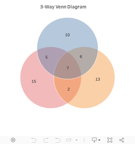
1.Calculate the coordinates for the centers of 3 circles
By default, I place them on a unit circle with equal distance between them: (0,1), (-0.5, 0.866), (-0.5, -0.866) at 120 degree apart. It's easy to calculate them: Cos(π/2+2*n*π/3), Sin(π/2+2*n*π/3) for n=0,1,2.
2.Create the data set
The data set has three rows for each of the 3 circles. We have 7 extra columns because of the values for each part in a Venn diagram. The 7 values are identical in each row.

Drag [Circle] to the Colors. Select the circle mark for the chart. Lower the opacity of the colors to see the intersection of the circles.
The default Size card in Tableau has a very limited range for continuous dimensions. By placing a calculated field [Constant] in the Size card, we are able to make the circle bigger.
4.Fix the axis
There is a fixed option in axis settings. However we may need to change that setting many times to place the diagram in the middle and leave enough space from the edge of the canvas. A parameter [Range] will make this tuning much easier.
Two symmetric reference lines at [Range] and -[Range] will fix the axis range. Both lines are hidden from view. We need them for both X and Y axis.
5.Place values by annotations
First you need to drag all the values to the Detail card. Then right click at the places you like to place those value labels on the chart. Select Annotate>Mark. Edit the annotation to have only the right value.
6.Format the annotations
My preference is selecting total transparency and no line.
Then you are done with a dynamic Venn diagram. Once you have a new data set, just refresh the data extract.
Set theory is so amazing that I can still remember how we did it in math class. We've been using venn diagrams for different purposes all alone. Compare and contrast and quiz type venn diagrams are good examples of what I'm talking about. Examples templates are the best way to understand these things. You can find more ready to use (customizable) Venn diagram templates in the diagram community of Creately. You can use and try them for free.
ReplyDeleteThis is awesome. I've got an additional charge, to make these circles dynamically resize the circles and move them relative to each other, based on the proportion of total counts of each circle. Any ideas on how to start on this?
ReplyDeleteIt's certainly doable. A simple answer is to put the count measure in the Size shelf. Need to understand the relative distances to each other. Once understood, we can always create the distance between circles accordingly.
Delete